Iowa Plots
While I was at Purdue, my field of student was computational chemistry. However, my specialization was in theory (scientific programming). This meant that alot of the methods we were developing required significant benchmarking of our ‘theoretical’ value to:
- experimental values
- theoretical values obtained through other historically robust methods of theory.
In terms of the profile of our data, correlations were obtained typically through variations of basis set, molecular system size, as well as level theory.
Analysis followed byInterpretation, as you can imagine, was very tedious as we would have to continuously scan over numerical data organized in tabular spreadsheets. The volume and complexity of the data make it difficult to pick up on trends and correlation. Because let’s be honest, scanning over millions of rows of numerical data is not an efficient means of analyze.
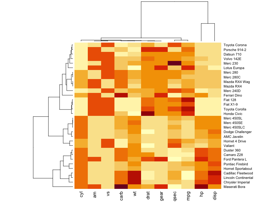
Pretty quickly we attempted to utilize ‘Heat Maps’ that were a betters mean to serve as graphical representations of data that utilize color-coded levels of correlation. It became a great means of surveying large volumes of data as the eye is able to pick up contrasting shades of color much faster than numerical differentiation.
i.e., the darker the color the greater the associated numerical value on a continuous scale.

However, you do lose some granularity with heatmaps are you subset the data into types - the visualization isn’t able to give insight into the frequency of occurrence that a correlation pairing might occur (this is important as you want to see how representative your dataset and how robust your average values are)!
A few years ago to combat this, IOWA plots were utilized to address this issue.
You can think of them as concatenated ‘heatmaps’ on steroids.
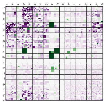
In my specific work, ended upload using IOWA plots to visualize over and underbinding types amino acid-amino acid side-chain side-chain interactions in our SSI dataset several years back. Lori Burns, the gal who pioneered the visualization was kind enough to share source code for generation of the following plot:

Her code was pretty clean and utilized basic python library packages:
import pandas as pd
import os
import numpy as np
import hashlib
import matplotlib
import matplotlib.pyplot as plt
from matplotlib.axes import Subplot
Generation of the Iowa plot uses the main function plot_iowa:
def plot_iowa (data):
    data = pd.read_csv(data,sep='\s+',header=0, names=['file','type1','type2','EFP','CCSD'])
    mclbl = (data.file).tolist()
    mcdat = (data.EFP - data.CCSD).tolist()

    title = ''
    xtitle = ''
    xlimit = 5
    view = True
    saveas = '/Users/ybui/Documents/temp'
    relpath=False
    graphicsformat = ['pdf']

    iowa(mcdat, mclbl, title=title, xtitle=xtitle, xlimit=xlimit, view=view, saveas=saveas, relpath=relpath, graphicsformat = graphicsformat)
plot_iowa reads in the spreadsheet/csv file with four columns detailing the ‘name’ of the interaction as ‘file’, the type of amino acid A and amino acid B as ‘type1’ and ‘type2’, and the obtained experimenta EFP energy value ‘EFP’ and associated benchmarking CCSD value ‘CCSD’.
It saves the differences between these methods as ‘mcdat’ as a list of EFP-CCSD energy differences (errors).
plot_iowa then assigns some configuration output flags for def iowa:
def iowa(mcdat, mclbl, title='', xtitle='', xlimit=2.0, view=True, saveas=None, relpath=False, graphicsformat = ['pdf']):

    aa = ['r', 'k', 'd', 'e', 's', 't', 'n', 'q', 'c', 'm', 'g', 'a', 'v', 'i', 'l', 'p', 'y', 'y','h','w']
    aa_full = ['ARG', 'LYS', 'ASP', 'GLU', 'SER', 'THR', 'ASN', 'GLN', 'CYS', 'MET', 'GLY', 'ALA', 'VAL', 'ILE','LEU', 'PRO','PHE', 'TYR','HIE','TRP']
    err = dict(zip(mclbl, mcdat))

    # handle for frame, overall axis
    fig, axt = plt.subplots(figsize=(6, 6))

    #axt.set_xticks([])  # for quick nolabel, whiteback
    #axt.set_yticks([])  # for quick nolabel, whiteback
    axt.set_xticks(np.arange(len(aa)) + 0.3, minor=False)
    axt.set_yticks(np.arange(len(aa)) + 0.3, minor=False)
    axt.invert_yaxis()
    axt.xaxis.tick_top()  # comment for quick nolabel, whiteback
    #axt.set_xticklabels(aa, minor=False, rotation=60, size='small')  # comment for quick nolabel, whiteback
    axt.set_xticklabels(aa_full, minor=False, rotation=60, size='small')  # comment for quick nolabel, whiteback

    #axt.set_yticklabels(aa, minor=False, size='small')  # comment for quick nolabel, whiteback
    axt.set_yticklabels(aa_full, minor=False, size='small')  # comment for quick nolabel, whiteback

    axt.xaxis.set_tick_params(width=0, length=0)
    axt.yaxis.set_tick_params(width=0, length=0)
    #axt.set_title('%s' % (title), fontsize=16, verticalalignment='bottom')
    #axt.text(10.0, -1.5, title, horizontalalignment='center', fontsize=16)

    # nill spacing between 20x20 heatmaps
    plt.subplots_adjust(hspace=0.001, wspace=0.001)

    index = 1
    for aa1 in aa:
        for aa2 in aa:
            cb = composition_tile(err, aa1, aa2)
            ax = matplotlib.axes.Subplot(fig, len(aa), len(aa), index)
            fig.add_subplot(ax)
            heatmap = ax.pcolor(cb, vmin=-xlimit, vmax=xlimit, cmap=plt.cm.PRGn)
            ax.set_xticks([])
            ax.set_yticks([])
            index += 1

    #plt.title(title)
    for posn in [3.85, 7.75, 10.65]:
        axt.axvline(x=posn, linewidth=5, color='k')
        axt.axhline(y=posn, linewidth=5, color='k')
    #axt.set_zorder(100)

    # save and show
    pltuid = title + '_' + hashlib.sha1(title + str(xlimit)).encode('utf-8').hexdigest()
    pltfile = expand_saveas(saveas, pltuid, def_prefix='iowa_', relpath=relpath)
    files_saved = {}
    for ext in graphicsformat:
        savefile = pltfile + '.' + ext.lower()
        plt.savefig(savefile, transparent=True, format=ext, bbox_inches='tight')
        #plt.savefig(savefile, transparent=False, format=ext, bbox_inches='tight')  # for quick nolabel, whiteback
        files_saved[ext.lower()] = savefile
    if view:
        plt.show()
    plt.close()
    return files_saved
###########
def iowa goes through a for loop for every type of amino acid to generate a subplot by calling def composition_tile:
xlimit = 5
def composition_tile(db, aa1, aa2):
    ## db = dictionary of values (AA1-AA2:#) --> length is approximately 3362
    import re
    import numpy as np
    import matplotlib.pyplot as plt

    bfdbpattern = re.compile('s\d\d\d([a-z])\d\d\d([a-z])\d')
    tiles = []

    for key, val in db.items():
            bfdbname = bfdbpattern.match(key)
            if (bfdbname.group(1) == aa1 and bfdbname.group(2) == aa2) or \
                (bfdbname.group(2) == aa1 and bfdbname.group(1) == aa2):
                tiles.append(val)

    if not tiles:
        tiles = [0]

    dim = int(np.ceil(np.sqrt(len(tiles))))
    pad = dim*dim - len(tiles)
    tiles += [0] * pad

    #print np.reshape(np.array(tiles), (dim,dim))

    #plt.pcolor(np.reshape(np.array(tiles), (dim,dim)), vmin=-xlimit, vmax=xlimit, cmap=plt.cm.PRGn)
    #plt.colorbar()
    #plt.show()
    return np.reshape(np.array(tiles), (dim, dim))
before saving all the heatmaps using def expand_saveas:
##########

def expand_saveas(saveas, def_filename, def_path=os.path.abspath(os.curdir), def_prefix='', relpath=False):
    defname = def_prefix + def_filename.replace(' ', '_')
    if saveas is None:
        pth = def_path
        fil = defname
    else:
        pth, fil = os.path.split(saveas)
        pth = pth if pth != '' else def_path
        fil = fil if fil != '' else defname
    abspathfile = os.path.join(os.path.abspath(pth), fil)
    if relpath:
        return os.path.relpath(abspathfile, os.getcwd())
    else:
        return abspathfile
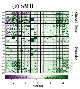
Go ahead and run the script, add some black bars and legends in pptx (this is not the script) to make it easier to group areas of correlation (reallly over and underbinding):
plot_iowa(small)

You can see the type of interaction and the number of types that specific type of interaciton occurs in the dataset in each heatmap. You also can see whether EFP over and under predicts the total energy of an interactions.
As such, it becomes very easy to see that with charged-charged interactions efp overpredicts and there seems to be alot more of those types of interactions so these errors need to be addressed in our theory some how in the future.
